


E-COMMERCE BOOKSHOP REDESIGN
This publication company has started its business from 2015 in the field of children and teenagers’ fictions, and at this moment of speaking, it has published more than 10000 volumes in this field.
SUMMARY
Porteghaal is a leading publishing house in the country, part of Bun Holding. Users were struggling to find the books they wanted on the website, so the company decided to fully redesign it. As the Product Designer, I led the whole process from research to launch, and the redesign increased conversion rate by 1.9%.
Why redesign? (promlem core)
Users were struggling with the buying process, based on call center feedback and social reactions. They couldn't find the book that they wanted. The site also didn't meet basic design standards and brand identity, so a redesign was needed from the homepage to the cart.
USERS'S GOAL
Find the desired book quickly and easily
Get enough information (preview, reviews, author details) to buy with confidence
Not get confused during the purchase process, all the way to the payment gateway
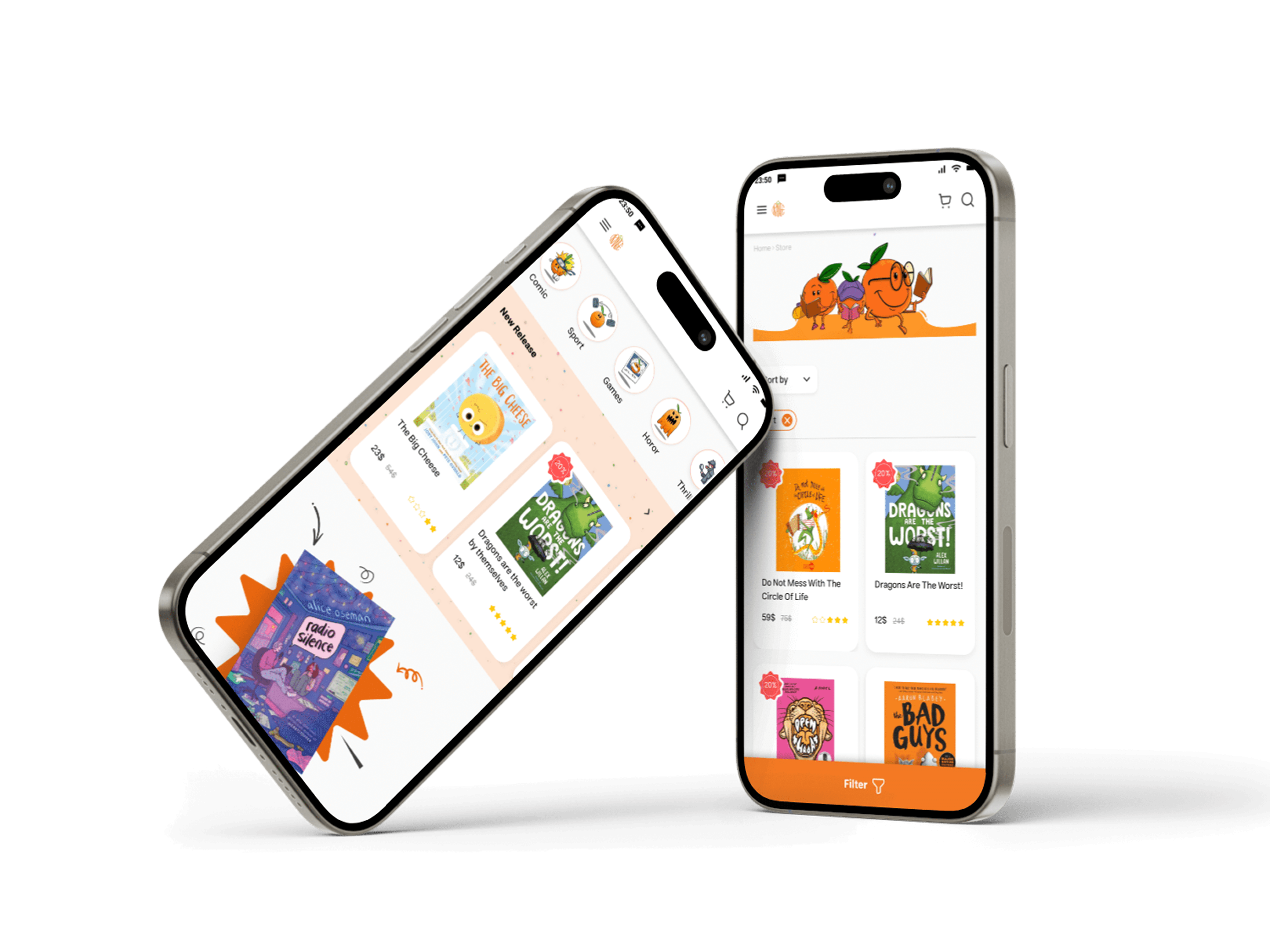
Have a smooth, easy-to-use mobile experience
BUSINESS GOAL
Increase conversion rate
Strengthen and clearly communicate brand identity
Make 30+ categories easy to browse and navigate
Reduce call-center complaints related to the website


Stakeholder: Sanaz Janpanah
This interview is aimed at their chief solicitations concerning the redesigning and it is as follows:
The eminence of the brand’s identity
Understandable displaying of the more-then-30 categories
Facile direction of the customer to the starting point of purchasing process
Mobile version
Dealing and giving details about the compilers of the intended book

DIVEE DEEPER
To conduct more thorough research, I decided to look at the site from the users' perspective. Using questionnaires and interviews, I aimed to identify exactly where drop-off was occurring in the purchase process.
Questionnaire Answered
2214
Remote Random Interview
5


DROP OFF
Users typically searched by title or author, but overwhelming filters made books hard to find
(3 users asked "how much more do I need to scroll?")
Book info pages lacked sufficient details, leading users to say they'd rather just call support
These struggles were severe enough that most users never made it to checkout

CURRENT WEBSITE
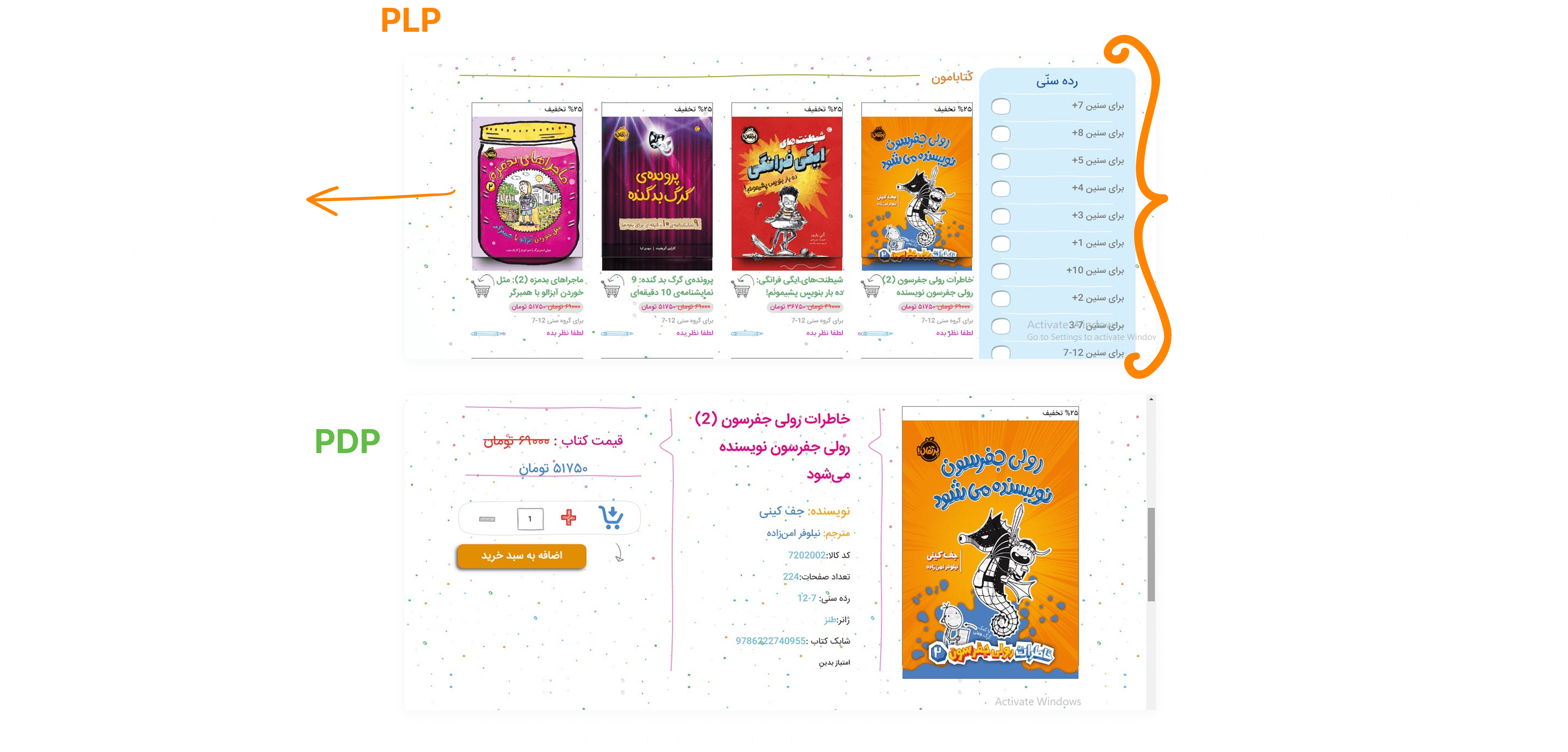
Despite having a clear brand personality and useful features like age-based filtering, the site suffers from several UI/UX issues that hurt usability, trust, and conversion.

SOLUTION
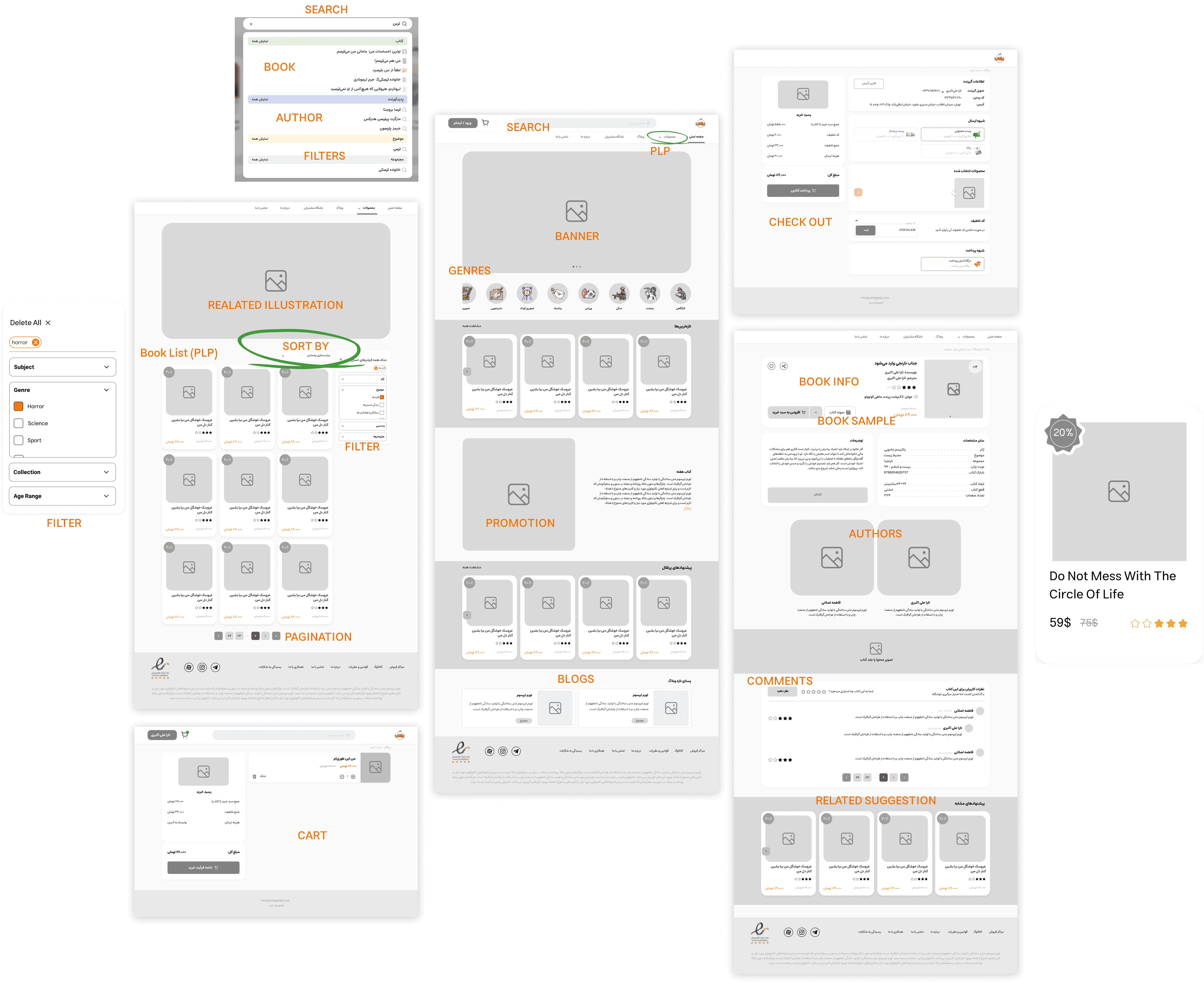
Improved the search engine with developers to search across 4 categories triggered after typing the first 3 characters
Increased homepage access to the PLP by adding genre-based category browsing
Reorganized the product listing page and filters into clearer, more defined categories
Added pagination at the end of each page and optional sorting
Added key info to the book detail page that users needed, such as complete book details and a sample preview

business goal
In order to meet the business goals set by the site owner, I aimed to redesign the site with minimal changes to the back-office system, ensuring promotions remained in their intended placements while significantly improving user access speed reducing the need for customer support calls. The design also maintained consistent brand identity throughout the site and included a fully responsive mobile version.


STYLE GUIDE


usability test
To measure the success of the redesign, I conducted the exact same usability test as before, this time with a new set of users and the results showed a significant, positive improvement.

Conversion Rate: +1.9%
Before the redesign, Portaghal Bookstore's conversion rate was around 1.3% across its 200,000+ users.
After the redesign, this increased to 3.2% more than doubling conversion, and at this scale it
translated into thousands of additional completed purchases.

E-COMMERCE BOOKSHOP REDESIGN
This publication company has started its business from 2015 in the field of children and teenagers’ fictions, and at this moment of speaking, it has published more than 10000 volumes in this field.
SUMMARY
Porteghaal is a leading publishing house in the country, part of Bun Holding. Users were struggling to find the books they wanted on the website, so the company decided to fully redesign it. As the Product Designer, I led the whole process from research to launch, and the redesign increased conversion rate by 1.9%.
Why redesign? (promlem core)
Users were struggling with the buying process, based on call center feedback and social reactions. They couldn't find the book that they wanted. The site also didn't meet basic design standards and brand identity, so a redesign was needed from the homepage to the cart.
USERS'S GOAL
Find the desired book quickly and easily
Get enough information (preview, reviews, author details) to buy with confidence
Not get confused during the purchase process, all the way to the payment gateway
Have a smooth, easy-to-use mobile experience
BUSINESS GOAL
Increase conversion rate
Strengthen and clearly communicate brand identity
Make 30+ categories easy to browse and navigate
Reduce call-center complaints related to the website
Stakeholder: Sanaz Janpanah
This interview is aimed at their chief solicitations concerning the redesigning and it is as follows:
The eminence of the brand’s identity
Understandable displaying of the more-then-30 categories
Facile direction of the customer to the starting point of purchasing process
Mobile version
Dealing and giving details about the compilers of the intended book
DIVEE DEEPER
To conduct more thorough research, I decided to look at the site from the users' perspective. Using questionnaires and interviews, I aimed to identify exactly where drop-off was occurring in the purchase process.
Questionnaire Answered
2214
Remote Random Interview
5
DROP OFF
Users typically searched by title or author, but overwhelming filters made books hard to find
(3 users asked "how much more do I need to scroll?")
Book info pages lacked sufficient details, leading users to say they'd rather just call support
These struggles were severe enough that most users never made it to checkout
CURRENT WEBSITE
Despite having a clear brand personality and useful features like age-based filtering, the site suffers from several UI/UX issues that hurt usability, trust, and conversion.
SOLUTION
Improved the search engine with developers to search across 4 categories triggered after typing the first 3 characters
Increased homepage access to the PLP by adding genre-based category browsing
Reorganized the product listing page and filters into clearer, more defined categories
Added pagination at the end of each page and optional sorting
Added key info to the book detail page that users needed, such as complete book details and a sample preview
business goal
In order to meet the business goals set by the site owner, I aimed to redesign the site with minimal changes to the back-office system, ensuring promotions remained in their intended placements while significantly improving user access speed reducing the need for customer support calls. The design also maintained consistent brand identity throughout the site and included a fully responsive mobile version.
STYLE GUIDE
usability test
To measure the success of the redesign, I conducted the exact same usability test as before, this time with a new set of users and the results showed a significant, positive improvement.
Conversion Rate: +1.9%
Before the redesign, Portaghal Bookstore's conversion rate was around 1.3% across its 200,000+ users.
After the redesign, this increased to 3.2% more than doubling conversion, and at this scale it
translated into thousands of additional completed purchases.
E-COMMERCE BOOKSHOP REDESIGN
This publication company has started its business from 2015 in the field of children and teenagers’ fictions, and at this moment of speaking, it has published more than 10000 volumes in this field.
SUMMARY
Porteghaal is a leading publishing house in the country, part of Bun Holding. Users were struggling to find the books they wanted on the website, so the company decided to fully redesign it. As the Product Designer, I led the whole process from research to launch, and the redesign increased conversion rate by 1.9%.
Why redesign? (promlem core)
Users were struggling with the buying process, based on call center feedback and social reactions. They couldn't find the book that they wanted. The site also didn't meet basic design standards and brand identity, so a redesign was needed from the homepage to the cart.
USERS'S GOAL
Find the desired book quickly and easily
Get enough information (preview, reviews, author details) to buy with confidence
Not get confused during the purchase process, all the way to the payment gateway
Have a smooth, easy-to-use mobile experience
BUSINESS GOAL
Increase conversion rate
Strengthen and clearly communicate brand identity
Make 30+ categories easy to browse and navigate
Reduce call-center complaints related to the website
Stakeholder: Sanaz Janpanah
This interview is aimed at their chief solicitations concerning the redesigning and it is as follows:
The eminence of the brand’s identity
Understandable displaying of the more-then-30 categories
Facile direction of the customer to the starting point of purchasing process
Mobile version
Dealing and giving details about the compilers of the intended book
DIVEE DEEPER
To conduct more thorough research, I decided to look at the site from the users' perspective. Using questionnaires and interviews, I aimed to identify exactly where drop-off was occurring in the purchase process.
Questionnaire Answered
2214
Remote Random Interview
5
DROP OFF
Users typically searched by title or author, but overwhelming filters made books hard to find
(3 users asked "how much more do I need to scroll?")
Book info pages lacked sufficient details, leading users to say they'd rather just call support
These struggles were severe enough that most users never made it to checkout
CURRENT WEBSITE
Despite having a clear brand personality and useful features like age-based filtering, the site suffers from several UI/UX issues that hurt usability, trust, and conversion.
SOLUTION
Improved the search engine with developers to search across 4 categories triggered after typing the first 3 characters
Increased homepage access to the PLP by adding genre-based category browsing
Reorganized the product listing page and filters into clearer, more defined categories
Added pagination at the end of each page and optional sorting
Added key info to the book detail page that users needed, such as complete book details and a sample preview
business goal
In order to meet the business goals set by the site owner, I aimed to redesign the site with minimal changes to the back-office system, ensuring promotions remained in their intended placements while significantly improving user access speed reducing the need for customer support calls. The design also maintained consistent brand identity throughout the site and included a fully responsive mobile version.
STYLE GUIDE
usability test
To measure the success of the redesign, I conducted the exact same usability test as before, this time with a new set of users and the results showed a significant, positive improvement.
Conversion Rate: +1.9%
Before the redesign, Portaghal Bookstore's conversion rate was around 1.3% across its 200,000+ users.
After the redesign, this increased to 3.2% more than doubling conversion, and at this scale it
translated into thousands of additional completed purchases.